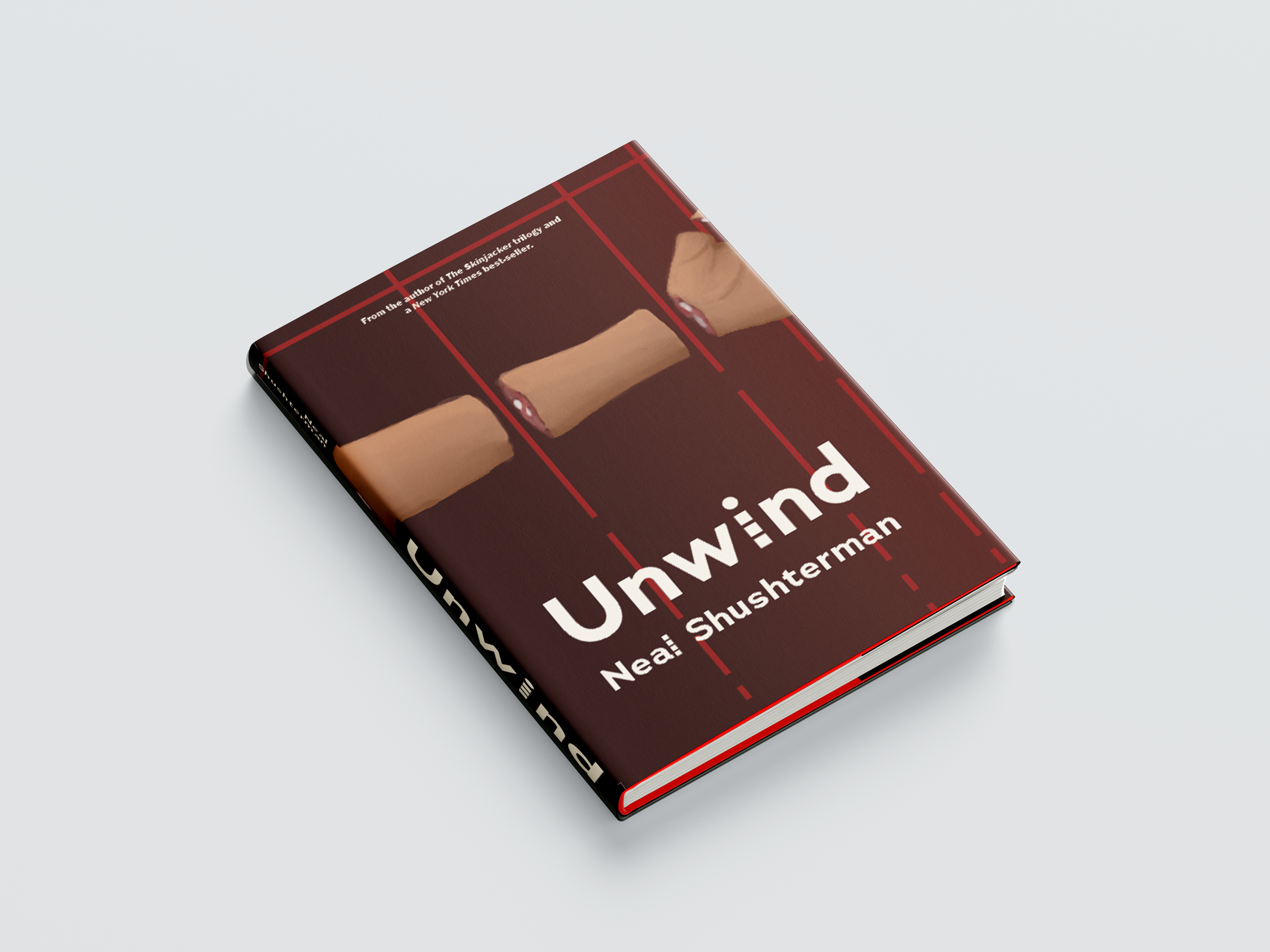
Dust Jacket
Neal Shusterman's 'Unwind' is a sci-fi novel with a very unique and dark premise. It illustrates a world where select children are 'unwound' and their body parts are used as donor parts, sometimes even as designer parts for the wealthy. Making a cover that would reflect and embody this story was certainly a challenge, but I knew my skills in illustration would help to set this dust jacket apart.

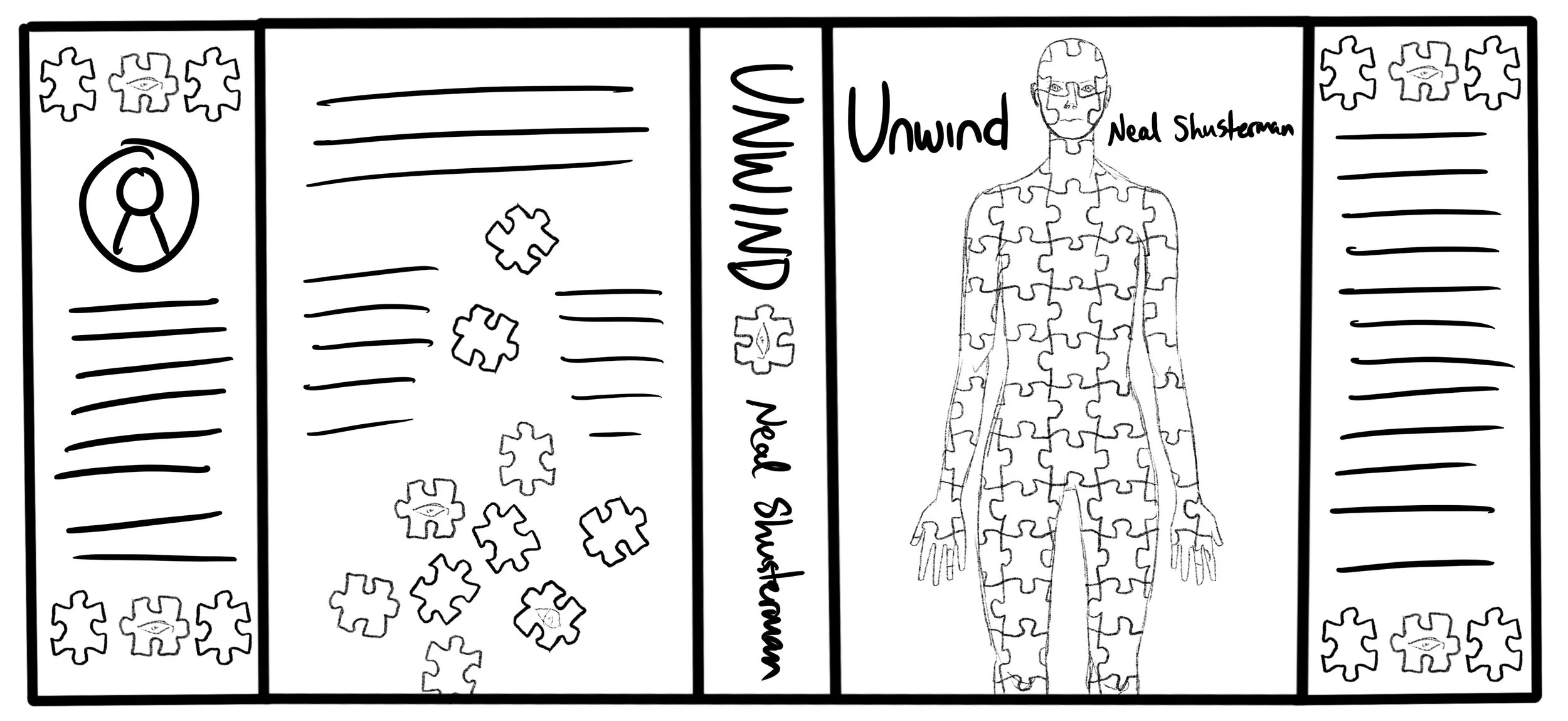
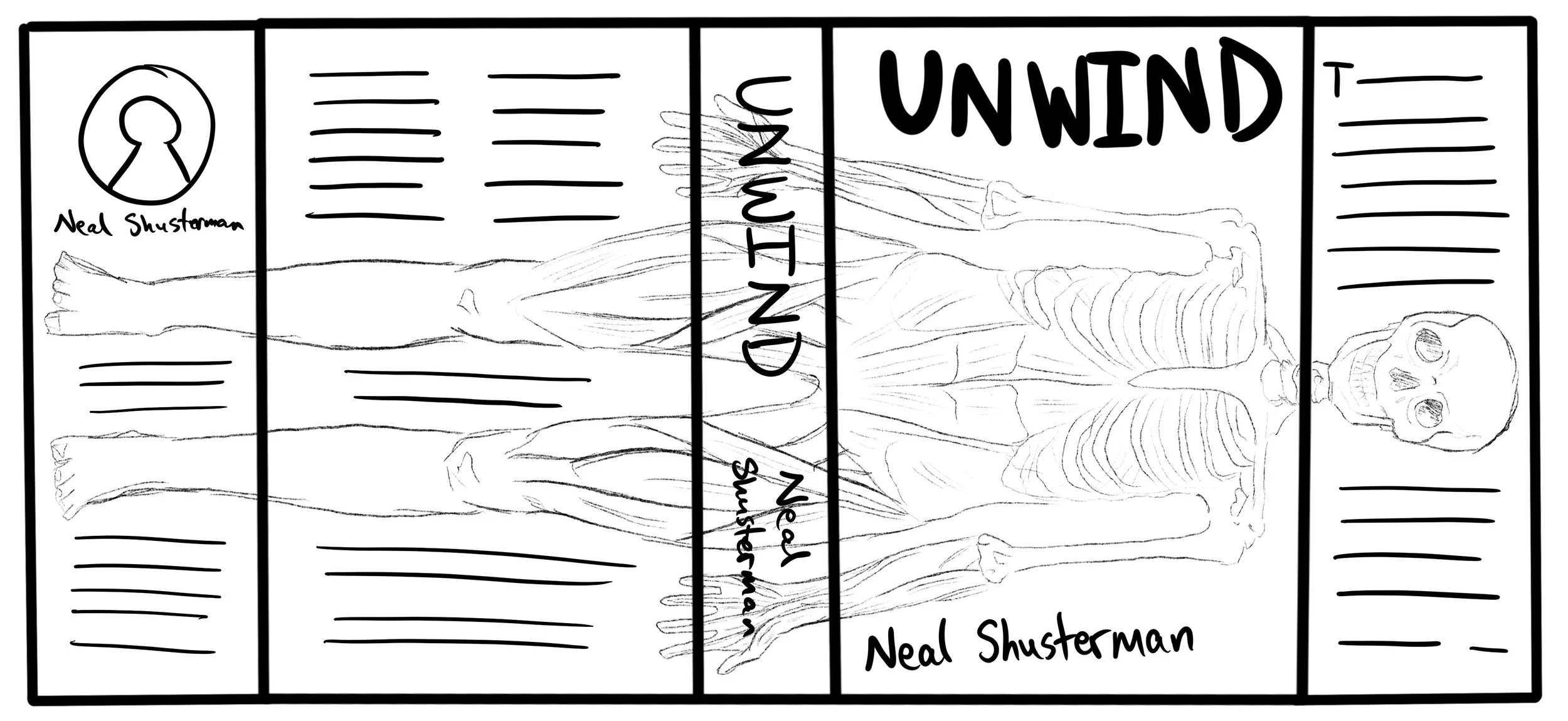
Sketches
I made many sketches in order to thoroughly explore this idea and attempt to find as many different angles to come at this project as I could. There were many directions I could have taken, but I wanted one with a simple, effective concept. I used many references for these sketches, mainly from medical diagrams and textbooks to add that touch of realism.


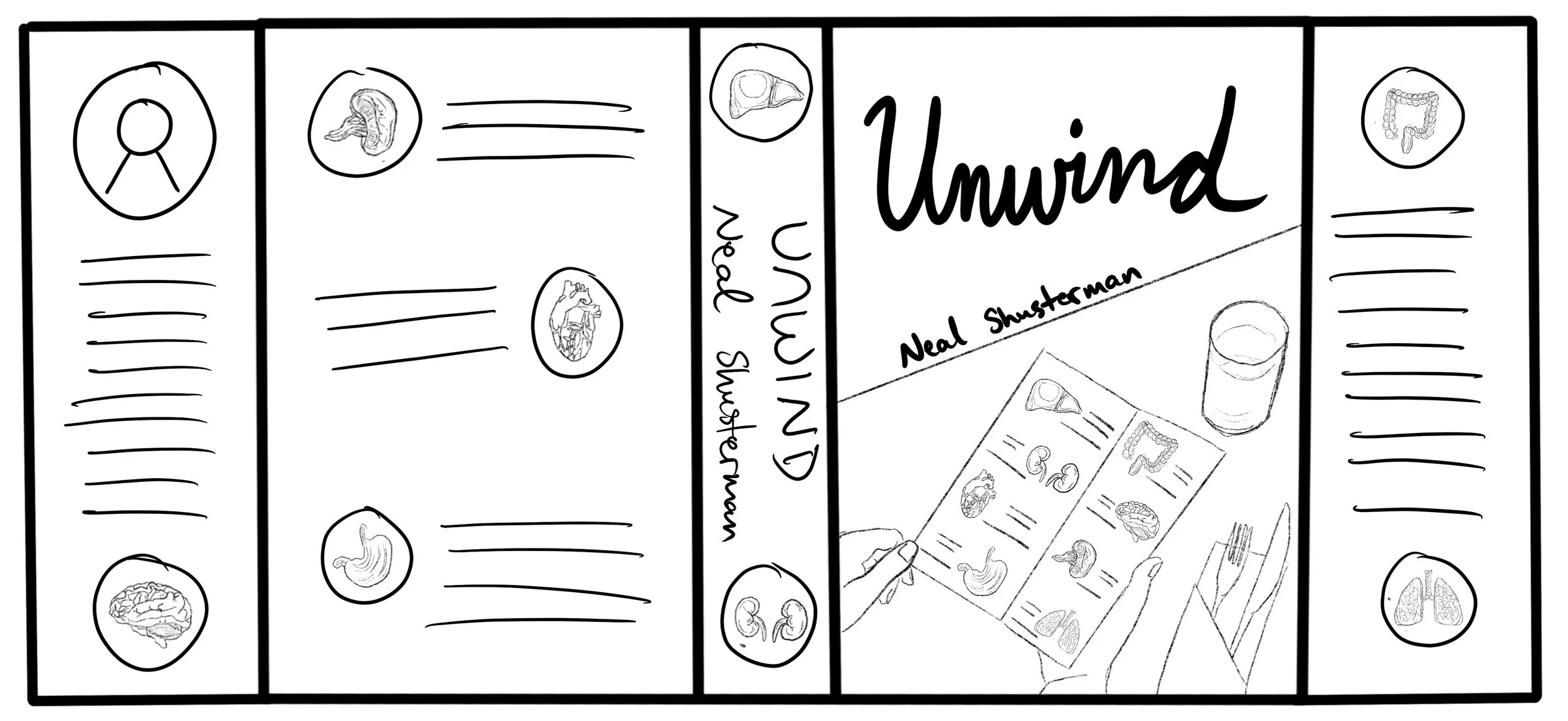


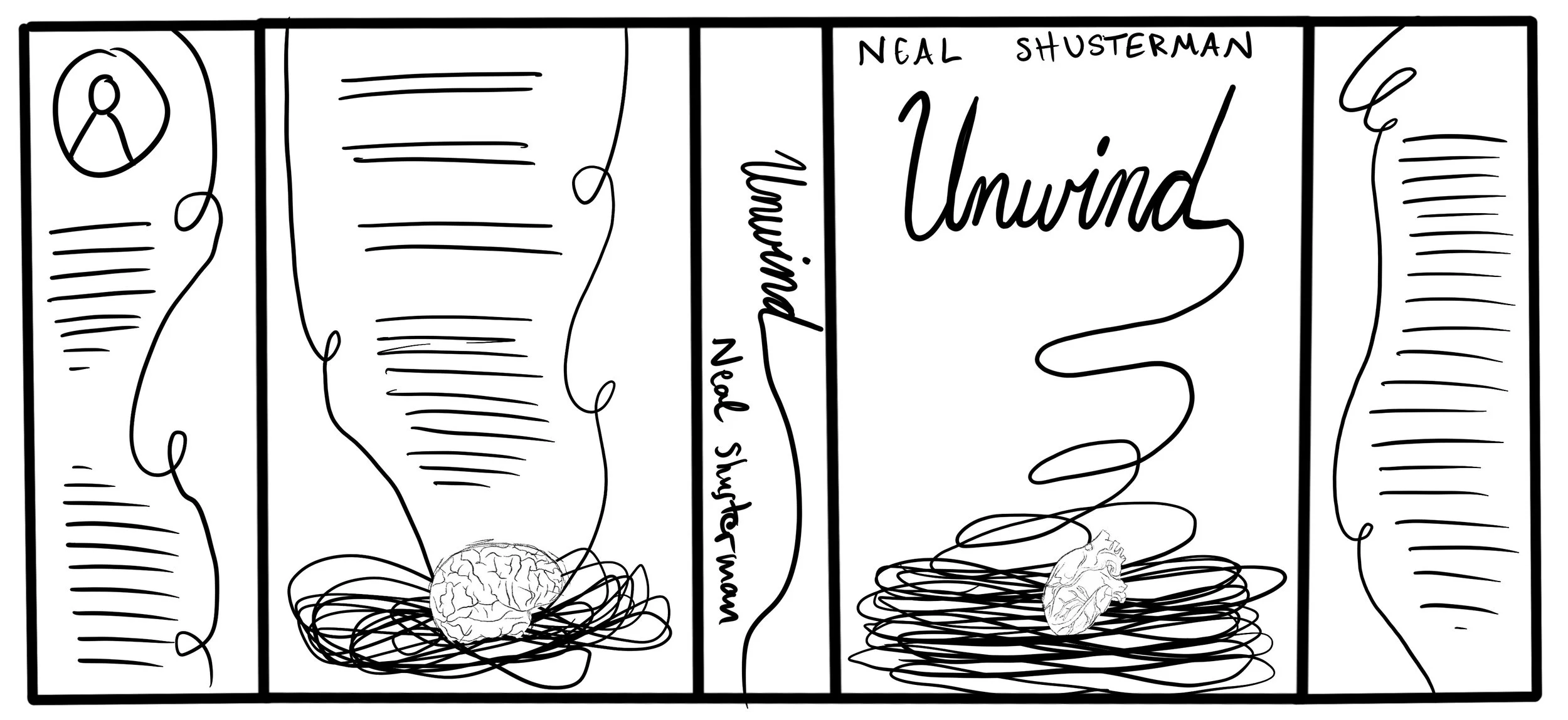

Digital Drafts
Before I reached the final solution, I went through a few drafts that still needed some final touches. I chose the segmented arm since I thought it drew the viewer's eye the most and emphasized that horror behind the story rather than making it seem more clinical than it truly is. I made hand-drawn illustrations for the arm and the secondary contender - the skeleton that gains muscle and skin - because I felt it would more effectively capture the image I wanted to convey over simple photo editing. By illustrating and making it look slightly less realistic, despite the references used, I feel people will be less hesitant to pick the book up and wonder what may lay inside.


Final Draft
We were tasked with making a dust jacket that embodied the themes of the book, to make something unique and eye-catching that would draw someone to pick it from the shelves. I wanted my design to convey the horror of the story, while also making you question how the image relates in the first place. I believe that my design was successful, as it draws the viewer in to not only see the full image as it wraps around the cover, spine, and to the interior, but also to discover what the meaning behind the segmented arm is, in context of the story. I also added the broken lines within the design and the typography to add a bit of further dimension to the design. The illustration is the main focus, but the lines add intrigue - reminiscent of both severing the limb and stitching it together.