
Brand Book
When we were tasked with creating a company to build a brand for, my mind went to the children’s museums I went to when I was young. I was always the most fascinated by the giant fossil exhibits, but I always wanted to know how they were put together and how they knew ‘what’ went ‘where’. I decided to build a brand based solely around this idea - a children’s museum that was solely focused on prehistory, specifically in relation to the Cleveland-Lloyd dig site.

Sketches
I made many sketches in order to thoroughly explore this idea and attempt to find as many different angles to come at this project as I could. There were many directions I could have taken, but I wanted one with a simple, effective concept.


Digital Drafts
When I started making the digital drafts, I was still undecided on the direction I wanted to take, so I just started making a bunch of variations to explore all of these ideas. I thought the mascot was the best direction to take as it spoke more to the younger audience that the museum was geared towards. I experimented with more simple and complex designs until I found one that worked the best.


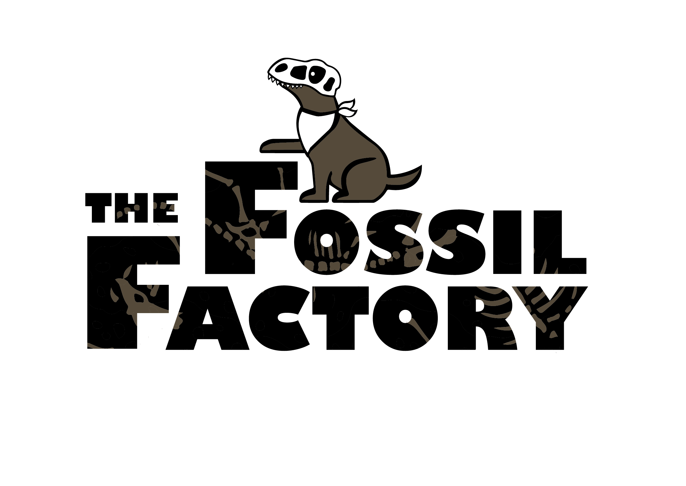


Final Draft
With the final logo chosen, it was a simple task to create a brand book that stayed consistent with that style. I used elements that were made in other logos to add a bit of interest and texture in the background of some of the pages since I thought they worked to be general brand elements. The colors chosen were reflective of the contents of the museum - emphasizing the central dig site attraction.


Brand Applications
Along with the brand book, I designed these general brand elements, sure as paper systems, envelopes, interior signage, business cards, and brochures. They all had to stay consistent with the brand guidelines outlines in the brand book, but that did make designing them fairly simple. With a comprehensive set of brand guidelines, designing elements that relate to the brand becomes quite easy. In these elements, the logo and mascot are prominent and the colors consistent.


