
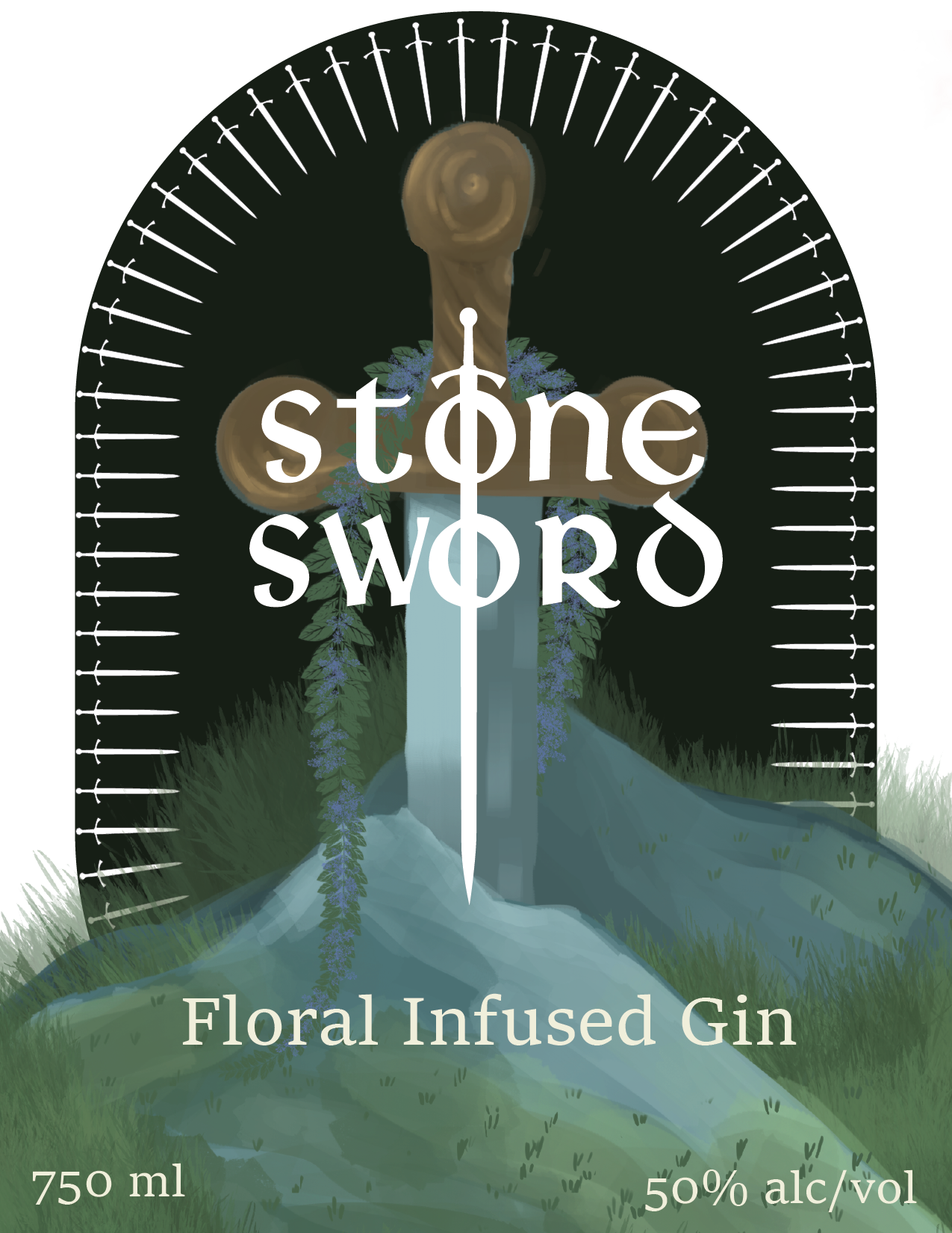
Bottle Label
I was wandering the aisles of a local liquor store when I noticed that nearly none of the branding I saw had much to do with liquor. Every label had more to do with the individual brand’s story and aesthetic, unlike how most other food products are advertised. They let the position of the bottle within its designated aisle do the heavy descriptive lifting so they could let the brand shine. For my design, I wanted to tell my own story, with my own unique branding to go along. I was struck by the tale of Excalibur, the idea of a hidden glade surrounded by the floral flavors that would be infused in this brand’s gin.

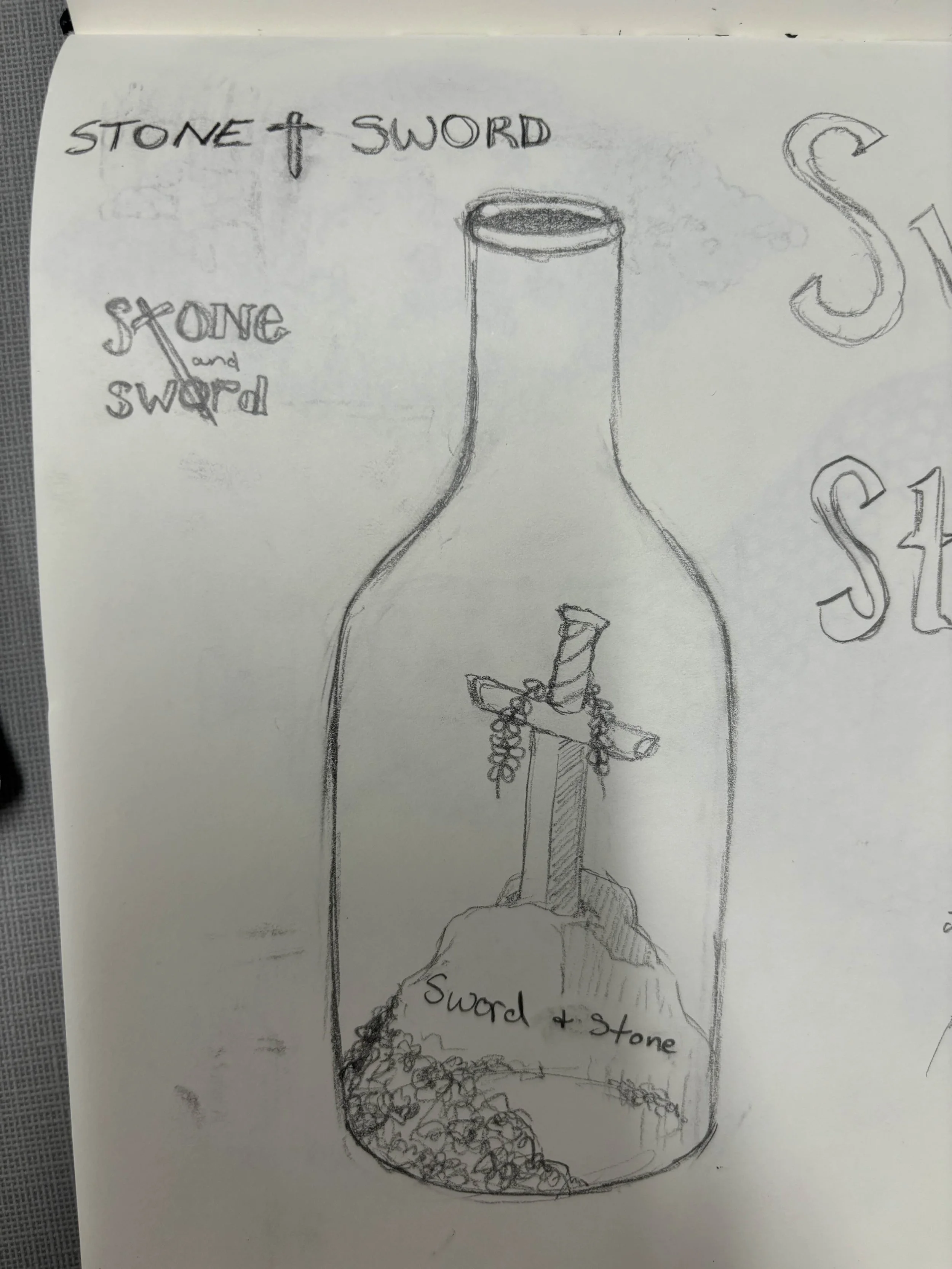
Sketches
With this floral, yet metallic - calling to mind the titular sword - as aesthetic guardrails, I began to sketch out various ideas that I could turn into a unified design. I realized quickly that this design was about contrasts, natural and man-made. Masculine and feminine. The hard and straight lines of the sword that was twisted around by the flowering vines. I knew the central idea had to be illustrative, but I wasn’t sure what would be the most effective way to tell the story that I could see coming to life.


Digital Drafts
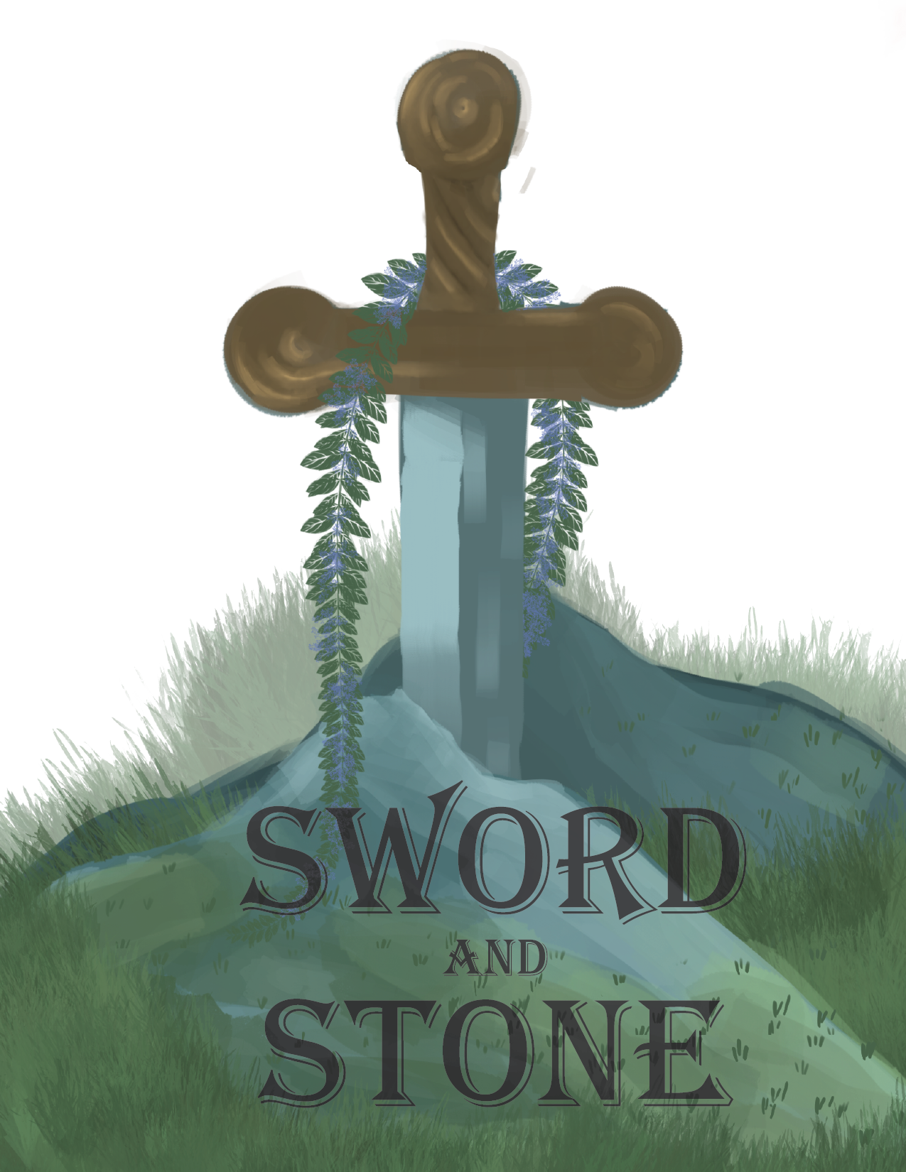
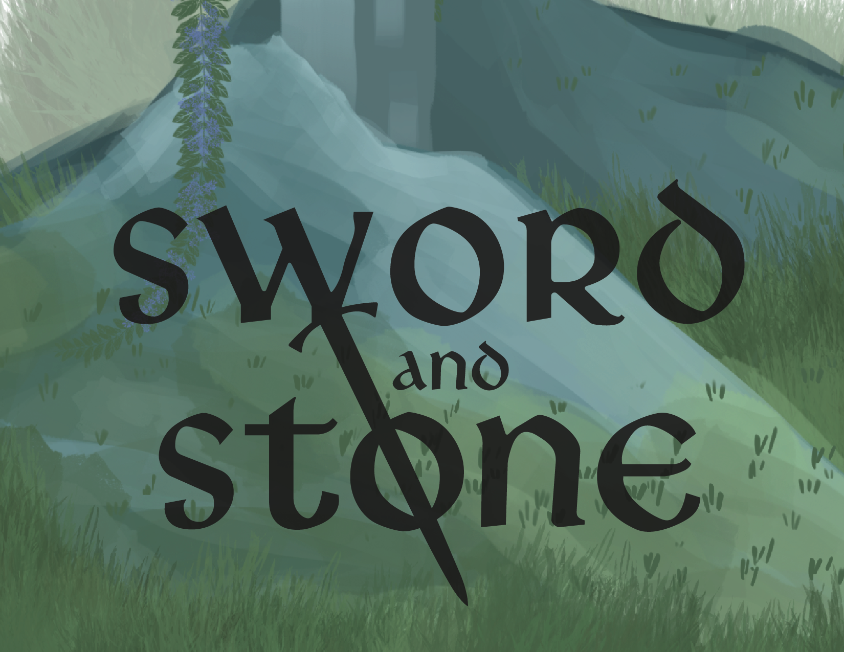
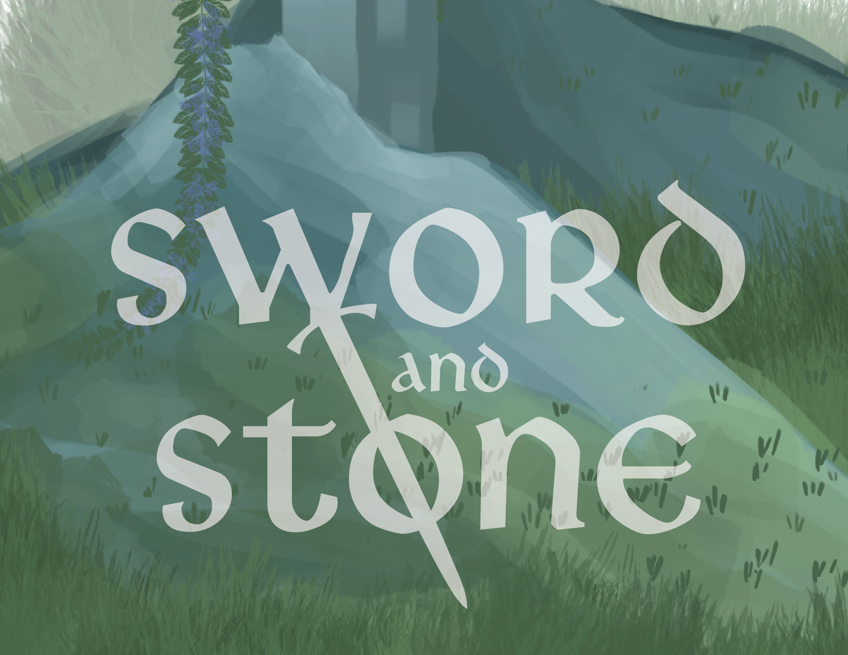
After I rendered the initial background of the sword in the moss-covered stone, I realized I had a bit of a dilemma. The illustration was strong, but was it competing to heavily with the text? The brand’s name needed to be the first thing the customer saw, so the placement and contrast it had in regards to the illustration was extremely important. I didn’t want these elements to compete with each other for the eye’s attention, so I needed to find a way to make them work together. What I eventually came up with was a darkened background illustration and a central alignment of the swords overlapping one another.


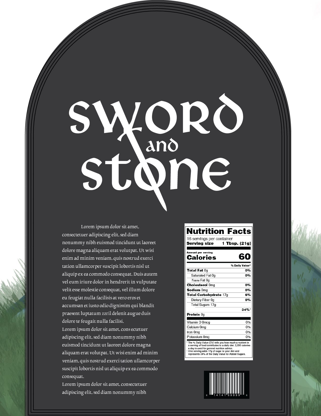


Final Draft
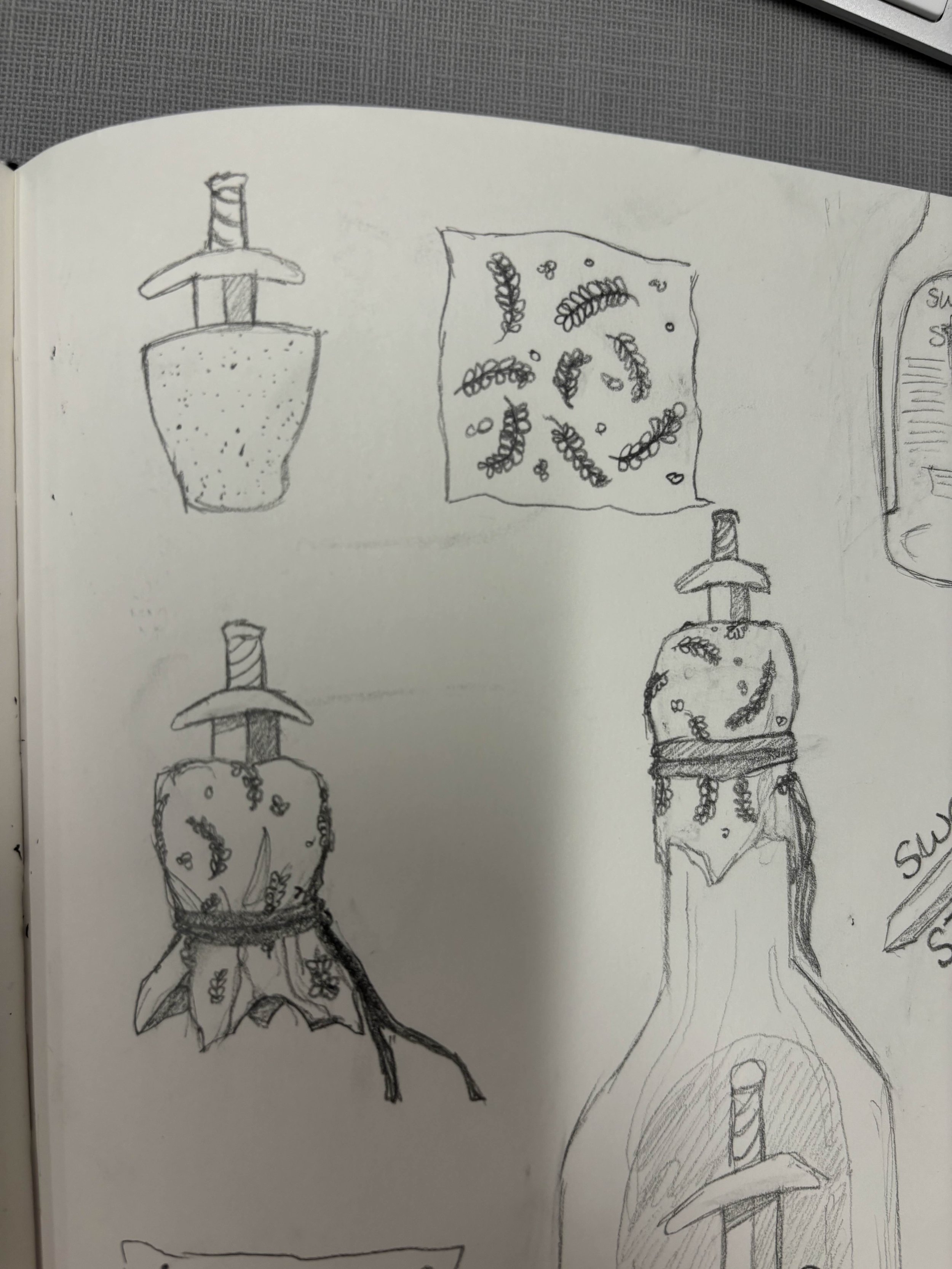
Once I figured out the most optimal placement of the logo, I went back to my initial ideation. In the stores I visited, I saw all these extra design elements outside of just the labels. Bottles had wax seals and fuzzy caps and small things dangling off that just made you want to touch them and display them once the bottle was finished. I realized this was a perfect opportunity to add a little extra something to my own bottles. I made a lightweight chainmail covering to surround the bottle, then a cloth wrapping that I embroidered with each unique flavor’s flower, and added a clay, hilt-shaped topper. I wanted my bottle to stand out on the shelves and to become something that was more of a keepsake.

![s&s_fullcolor [Recovered]-01.png](https://images.squarespace-cdn.com/content/v1/69236f885ab7b76fdf816075/1490f234-4f2f-49fb-aeac-5ab6bd359a97/s%26s_fullcolor+%5BRecovered%5D-01.png)
![s&s_fullcolor [Recovered]-02.png](https://images.squarespace-cdn.com/content/v1/69236f885ab7b76fdf816075/95eeb60f-4f1e-4d61-ba75-4d4d883be9d1/s%26s_fullcolor+%5BRecovered%5D-02.png)
![s&s_fullcolor [Recovered]-03.png](https://images.squarespace-cdn.com/content/v1/69236f885ab7b76fdf816075/cac81529-fd3c-41d6-9761-e49c3000403e/s%26s_fullcolor+%5BRecovered%5D-03.png)
![s&s_fullcolor [Recovered]-04.png](https://images.squarespace-cdn.com/content/v1/69236f885ab7b76fdf816075/c7f4bc1d-3127-4668-8269-ea3b6731ca4c/s%26s_fullcolor+%5BRecovered%5D-04.png)
![s&s_fullcolor [Recovered]-05.png](https://images.squarespace-cdn.com/content/v1/69236f885ab7b76fdf816075/bf4c5746-88b4-434e-880c-48e8fc47d71a/s%26s_fullcolor+%5BRecovered%5D-05.png)
![s&s_fullcolor [Recovered]-06.png](https://images.squarespace-cdn.com/content/v1/69236f885ab7b76fdf816075/889168d6-789f-49f9-984d-e8c7c67669ce/s%26s_fullcolor+%5BRecovered%5D-06.png)